
Rachel & Vine
Context
A concept brief for a small-batch goods brand — the kind of catalogue that doesn’t fit neatly into a generic store theme’s flat grid, because the products are meant to be browsed as collections, not scrolled past individually.
Approach
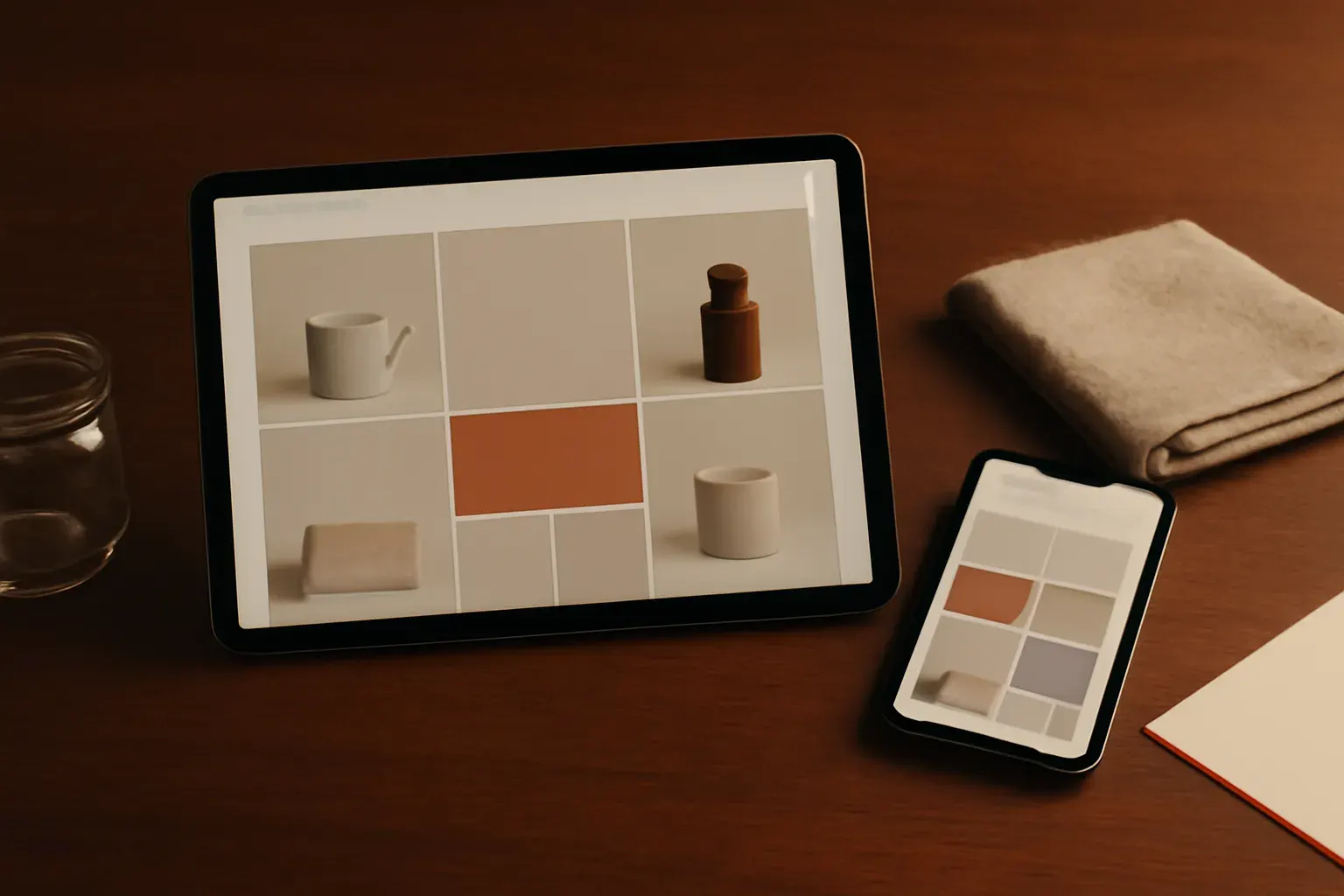
We designed the storefront around collections first, individual products second — seasonal groupings and material stories carry the browsing experience, with product pages reserved for the detail a buyer needs once they’ve found something they want. Checkout was kept short and calm, matching the brand’s own pace.
What we made
- Homepage
- Collection landing pages
- Product page template
- Cart & checkout flow
Outcome
As a studio concept, this project demonstrates our approach to e-commerce for a considered, small-batch catalogue — collection-first navigation instead of a generic product wall. It has not been built or launched for a real client.